Beautylish
A better beauty products shopping experience with new features
OVERVIEW
Beautylish is an online beauty store offering beauty products. This case study aims to improve the user experience and interface of the Beautylish app that helps customers when they make buying decisions and increase brand engagement with Beautylish and its app.
MY ROLE
User Research, UX/UI design, Prototype
TIME
Jun 2020 - Sep 2020
TOOLS
Figma, Photoshop

THE
PROBLEMS

Ineffective UI
The app doesn’t have an effective homepage to guide customer shopping.

Inconvenient Experience
The navigation tab menu confuses users. There are a lot of steps to achieve a goal and the workflows are not clear.

Lack of Feature
There aren't additional features to help customers making buying decisions. Besides, the app lacks customized shopping experiences.
”
THE
SOLUTIONS

Appealing UI
Improve UI that is engaging. Rethink carefully about element placement to make the interface easy to learn.

Improving Usability
Reorganize the app in a way that made sense to the user, including the tab menu. Speed up the buying process, and reduce the checkout steps.

New Features
Increase engagement, with shopping-related functions of the app, such as skin anaylsis, review filtering and brand following.
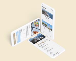
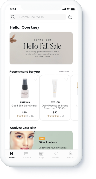
HI-FI
PROTOTYPE
01
Find the right foundation by analyzing the skin condition and read helpful product reviews
Users can use the skin analyzing tool to understand their current skin condition and view the product recommendations by skin analyzing results. Besides, users can filter reviews from other customers who have the same skin condition as hers.
02
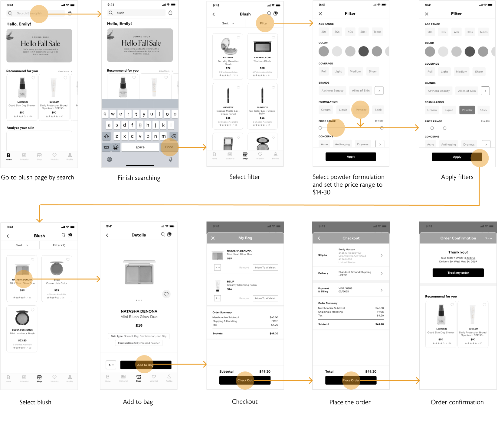
Find a powder blush in a certain price range and check out all the items in the shopping bag
Users can filter multiple categories at once. The one-step checkout process saves time.
03
Follow the brand BOSCIA
Users can follow the brands they like and quickly check the promotion and new arrivals from their favorite brands.
RESEARCH
Target Audience and App Reviews
I started from secondary research to understand the target audience of the brand and the app reviews on Apple App Store.
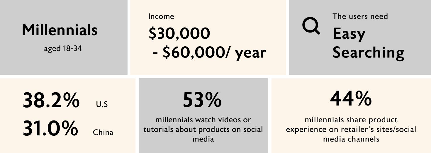
Understanding Target Audience
I interviewed five people who had shopping experience at beauty brand’s app, including one person who had shopped at Beautylish app. I separated my interviewees into two segments based on their behavior when shopping beauty products on the app.
Beauty product enthusiast
They like to try different products from different brands.
Loyal to particular brands
They are goal-oriented when making the buying decision.
INTERVIEW
TAKEAWAYS
01
The app's interface doesn’t appeal to the users
The app lacks a home page. Users want to view campaigns, promotions, and best-selling products on the homepage, and they regard the homepage as a shopping guide to start shopping. The app doesn't provide customized product lists for users, so the Beautylish app doesn't attract them.
“The homepage guides me where to start shopping if I don’t have a specific product I want to purchase.”
“There is no recommendation list, promotion and reviews, so the app doesn’t attract me.”
02
It is not easy to complete a task.
The users were confused about the purpose of the “Browse” tab on the tab menu and the setting icon on the top left corner. Frequent buyers expect the app to have a fast checkout feature and fast filter process, but the app doesn’t have them.
“I don’t understand the meaning of browse tab on the tab menu.”
“The checkout process is too slow, which makes me impatient to complete it. ”
03
Different shopping behaviors and pain points while shopping online
Beauty product enthusiasts like to try new products, but sometimes they aren’t sure if the products are appropriate for their skin. Customers who are loyal to particular brands prioritize buying products from their favorite brands.
“I love to browse and purchase the latest makeup recommended by my favorite Youtuber, but I am not sure if the product suits my skin condition.”
“I am loyal to a particular skincare brand and I trust their products.”
PERSONA
Social media influencer

I want to understand my skin condition and find the right products for my skin.
”About
- Age
- Occupation
- Status
- Location
- 33
- Marketing Manager
- Married
- New York City, NY
User Routine
Chloe is highly active on social media. As a social media influencer, Chloe is enthusiastic about sharing beauty products with her followers. She reviews her skin condition very often and wants to find the right product for her skin. She relies on product reviews before purchasing the item.
User Goals
- - Get a precise skin analysis.
- - Find the right foundation for her skin condition and her skin shade.
- - Read the helpful reviews that have the same skin type as hers.
User Frustrations
- - Chloe doesn’t have time to go to store to try products.
- - The reviews couldn’t help her while making the buying desicion.
Scenario
Chloe wants to understand her skin condition and she is going to find the foundation for her skin condition and shades. Chloe reads the reviews before placing the order.
User Task
Find the right foundation by using skin analyzing feature. Read the product reviews from customers who have the same skin type as Chloe's.

Beauty Products Enthusiast

I want to quickly checkout the items in the shopping cart.
”About
- Age
- Occupation
- Status
- Location
- 23
- Student
- Single
- Los Angeles, CA
User Routine
Emily absorbs information about beauty trends by viewing blogs and videos. Emily prefers to order above a certain amount to qualify for free shipping. She always saves the products to her wishlist to review and purchase them when there is a promotion.
User Goals
- - Filter a blush by formulation and price at the same time.
- - Fast checkout.
User Frustrations
- - Slow buying process.
- - Too many steps of checkout.
Scenario
Emily is going to add a powder blush, which is in the $14-30 price range, to her shopping bag to qualify for free shipping. Then, she checks out all the items in the shopping bag without being charged the shipping fee.
User Task
Find a powder blush in a price range. Check out all the items in the shopping bag and place the order.
Loyal to Brands

I always browse and purchase new arrivals from the brand I like.
”About
- Age
- Occupation
- Status
- Location
- 28
- Software Engineer
- Single
- San Francisco, CA
User Routine
Courtney is loyal to the skin care brands she loves. She always checks new arrivals or promotions from her favorite brands.
User Goals
- - Follows her favorite brand.
- - Looks up new arrivals from her favorite brands.
User Frustrations
- - Time comsuming to search the information of the brands she likes.
- -Always misses the promotion from her favorite brands.
Scenario
Courtney is loyal to Boscia. She is going to follow Boscia so she can check if there's a promotion or new arrivals for later easily.
User Task
Follow the brand BOSCIA and check the new arrivals from the following brands.

USER
TESTING
Before heading to hi-fidelity design, I tested three users and evaluated their user experience by observation and participants' feedback. In some steps, users spent more time than I expected to complete the flow or even failed the task. The following is user testing major refinement.

Click to enlarge image
USER TESTING
REFINEMENT
Skin Analyzing

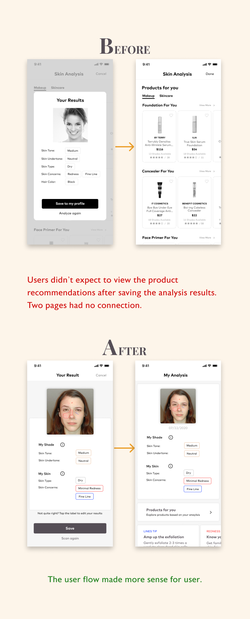
After completing skin analysis and saving it to the user profile, the user claims the screen should forward it to the profile page. The previous action is considered a profile update action. The new version of this user flow eliminates this confusion. After saving the results, the next screen users would see is the “My Analysis" page, which includes the skin analysis results, the link of product recommendations, and tips based on results. Users can view the analysis results on the account (profile) page.
Product Reviews
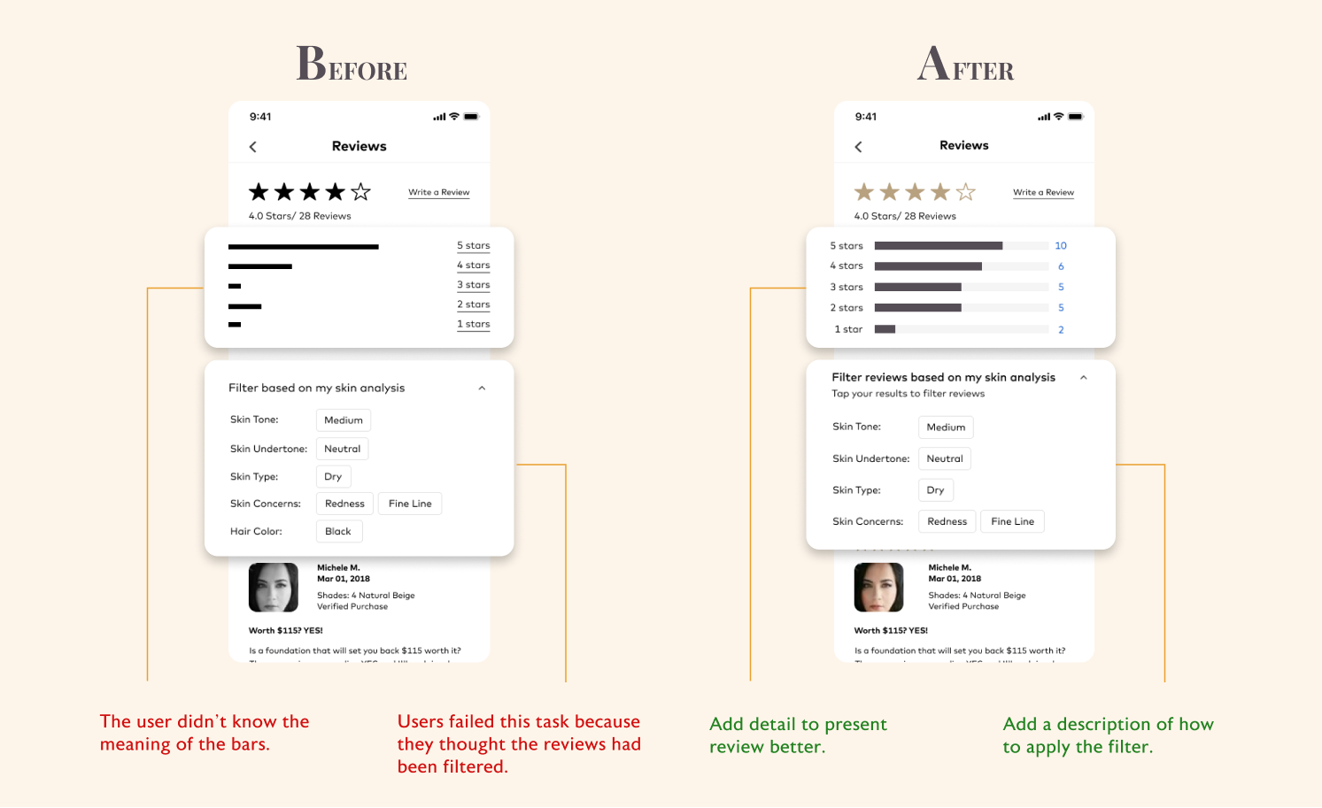
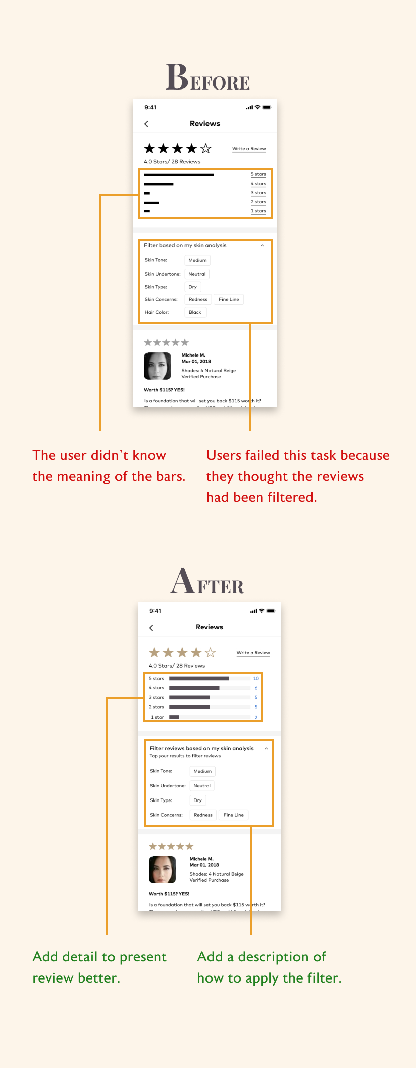
Two interviewees spent more than 40 seconds to understand and finish this task, and one interviewee failed this task because she thought the task had been completed. She assumed that the reviews had been filtered automatically after saving the skin analysis results. To solve this problem, I talked to users to understand their behavior when filtering products and their thoughts about this task. I finally decided to add a description that guides users on how to filter the reviews.
User Account

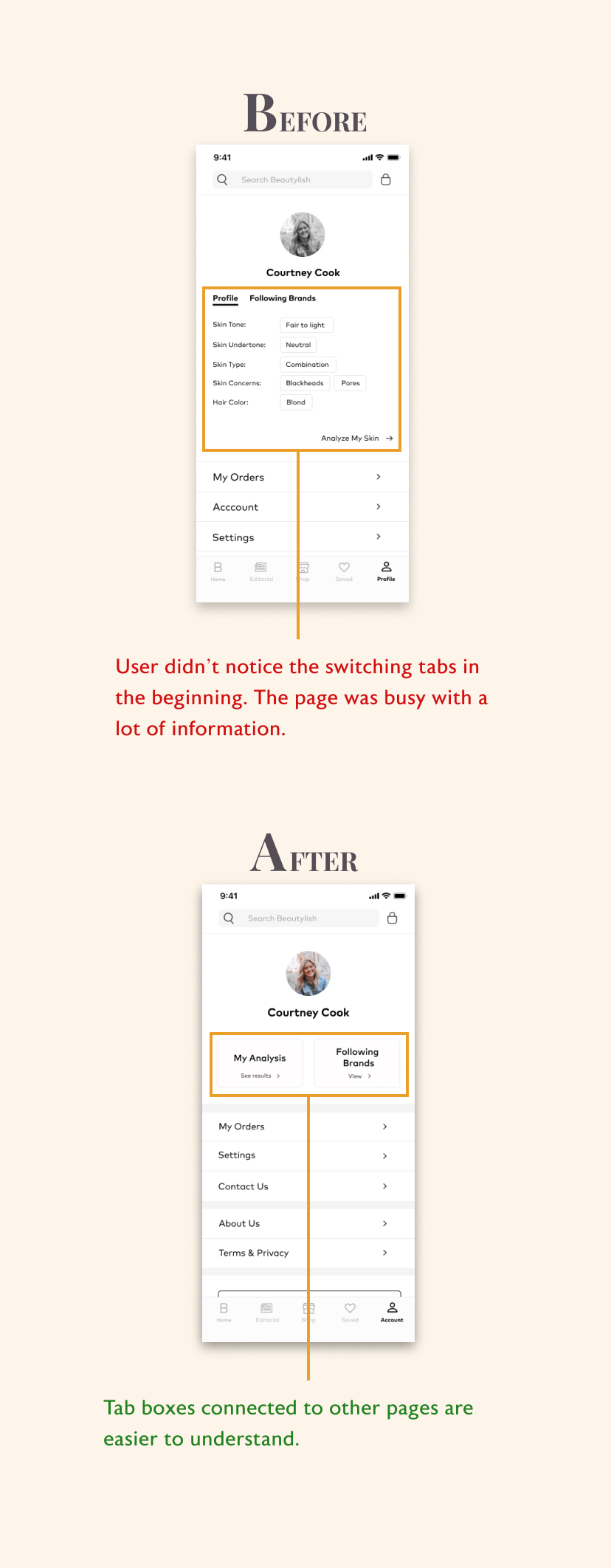
Two interviewees initially scrolled down the page and didn't notice tabs to change the pages. The user also mentioned that the "analyze my skin" button isn't apparent to tap. Besides, the page looks busy with a lot of information. In the new design, I replaced the switching tabs with two tab buttons with copy such as "see results" and "view," and each tab box connected to different pages. I also renamed the profile page to the account page because it shows more than just its profile.
What I Learned
Understanding the users
With this project, I have learned that an effective user experience starts with a good understanding of the user. Different types of users have different shopping behaviors. Although the users have similar goals, the pain points would be different. I couldn't help everyone achieve their goal using the same solution. In this case, I applied different solutions to help users make buying decisions based on different user segments.
Prioritize user feedback
When I interviewed the target audience, they gave me many valuable insights when using the Beautylish app. However, I couldn't solve all the problems at the same version of redesign, so I prioritized all user's needs using the 2x2 priority matrix. This method helps me identify which feature users needed it immediately so that I can solve the most crucial problem for the business and make profits.
Next Steps
Increase engagement with the non-shopping-related functions of the app
According to the interview feedback and secondary research, primary users tend to consult beauty questions and products via social media or friends. Adding the community in the app could not only help the user find their answers, but increase engagement with the brand.
MORE PROJECTS